Yumly
A recipe app designed end to end. First of 200 designers in the UI/UX Grand Prix.
1st
of 200 designers
0 → 1
research through to shipped design system
The problem
Recipe apps are abundant and mostly interchangeable: a search box over a content pile. The competition brief was open, so the first real task was finding a problem worth solving rather than a screen worth decorating.
Competitor analysis across the existing apps showed where they overlapped and, more usefully, what none of them did — which is where the product decisions came from.
How it works
Research before screens
Competitor analysis, three user personas, and an empathy map covering what users say, think, do and feel. Problem statements and pain points were written from that research rather than assumed, so later design decisions had something to be accountable to.
Structure before visuals
Ideation, then information architecture, then user flows — including the decision points where a flow branches. The app's shape was settled while it was still cheap to change.
A design system, not a set of screens
Type scale, colour, spacing and components defined as a system, so the high-fidelity screens are assembled from tokens rather than drawn one at a time. That is the difference between a design that can be built and a design that has to be reinterpreted.
Then the interface
High-fidelity wireframes, then the full screen set — home, AI meal recommendations, single recipe pages, and the supporting flows around them.
In the product
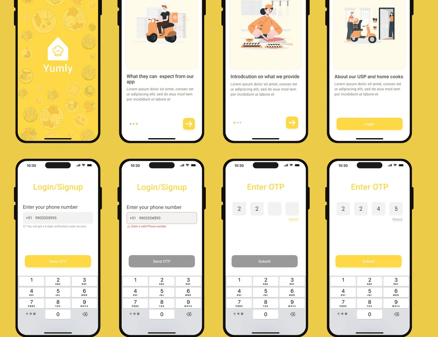
The full screen set — onboarding, auth, browse by cook and by meal, filters, cart, payment and order tracking, all assembled from the same tokens.
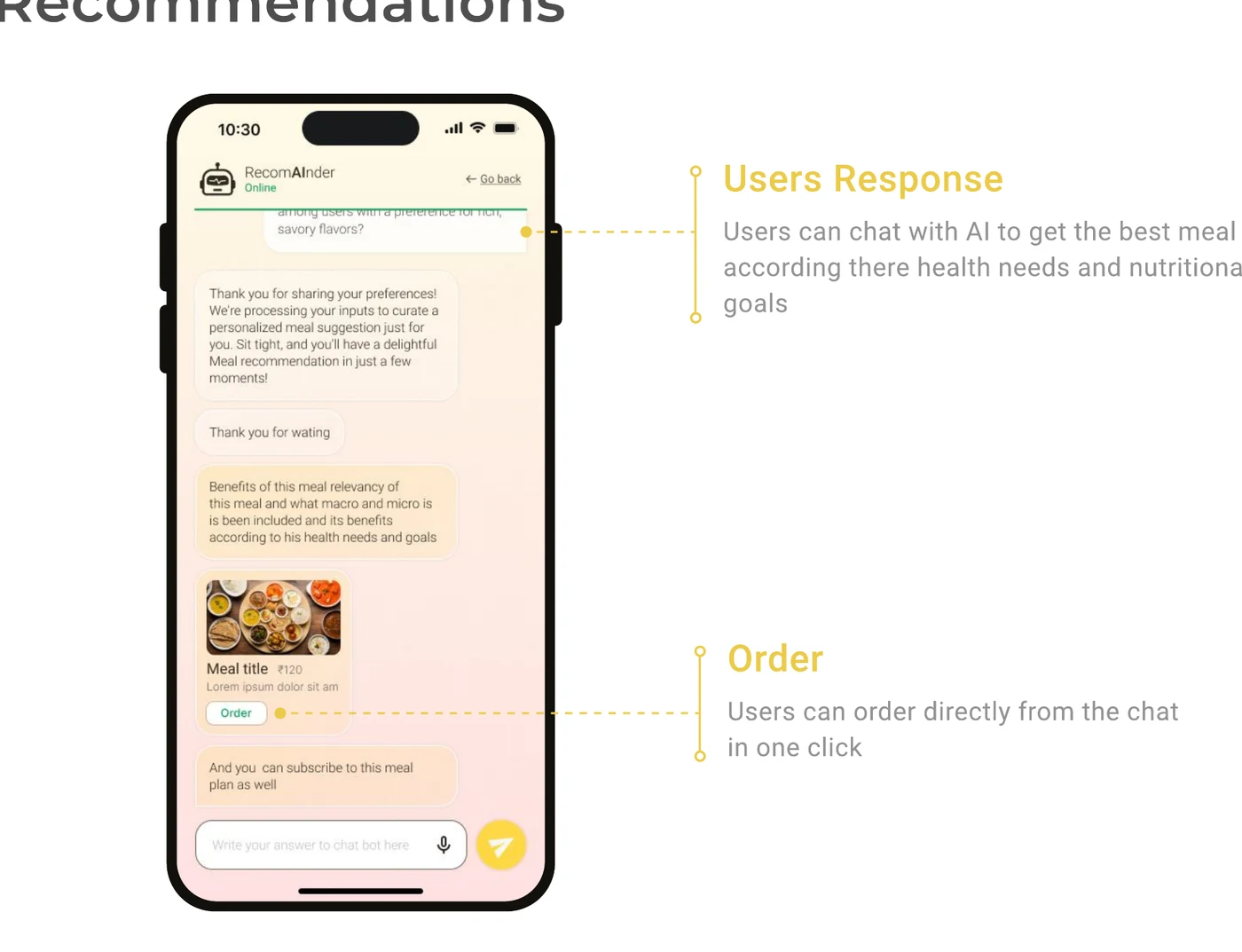
AI meal recommendations: the user chats about health needs and goals, and can order the suggested meal directly from the conversation.
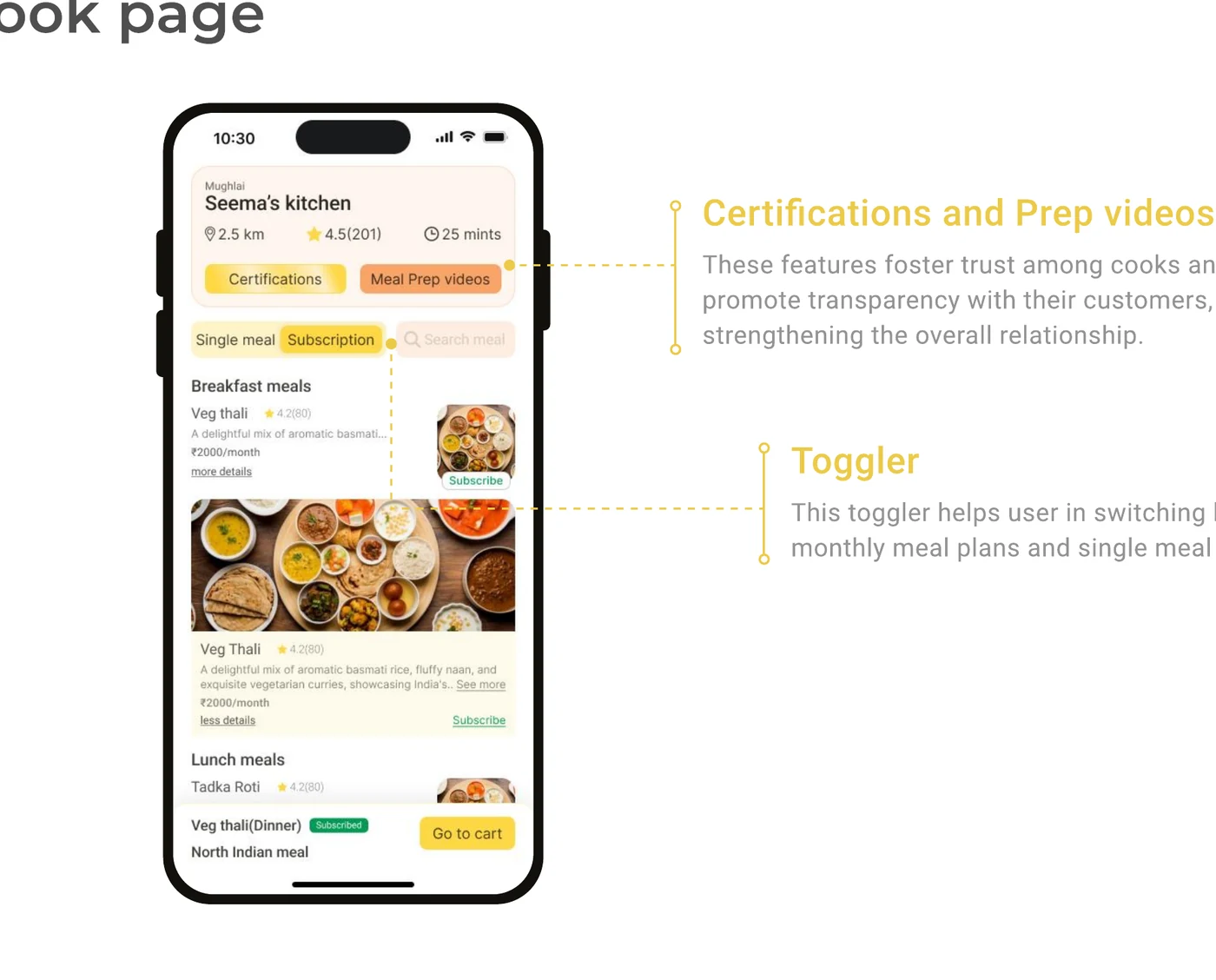
A single cook's page. Certifications and prep videos build trust between cook and customer; the toggle switches between a monthly plan and a single meal.
Decisions worth defending
Time spent on research and IA rather than more polished screens. The case study is what won, and the reasoning is why.
A documented design system as a deliverable, because a design a developer cannot build is not finished — and building is the half most designers hand off.
One coherent product rather than a showcase of unrelated screens.
Outcome
First place out of 200 designers. More usefully, it is the artifact I point at when I say the design half is real: the same process runs before the interfaces I build at work.
Built with
More work
Start a conversation